
How Thumbnail Design Impacts CTR
How Thumbnail Design Impacts CTR
Your thumbnail can decide the click before your title does. The article’s main point is simple: if you want more clicks, I’d focus first on clear layout, strong contrast, short text, and human faces that are easy to read on a phone screen.
Here’s the short version:
- CTR is the percent of people who click after seeing your video.
- A strong CTR is often around 4% to 8%, and 8%+ is top-tier in many niches.
- Thumbnails with one clear subject and 0–2 words tend to do better than busy designs.
- High contrast usually helps more than flat, blended visuals.
- 1–3 bold words beat long text in most cases.
- Faces often outperform object-only thumbnails, and one study found thumbnails with faces averaged 921,000 more views.
- Direct eye contact, a readable expression, and a close crop can help.
- The best way to improve results is to test one change at a time and check retention with CTR.
If I had to boil the full article down to four rules, it would be this:
- Make the subject obvious
- Make the thumbnail easy to read at small size
- Use less text
- Test changes one by one
A click means little if viewers leave right away. So the goal isn’t just more clicks. It’s getting the right clicks from people who will keep watching.
That’s what the research, test data, and creator examples point to.
Thumbnail Design Factors That Boost YouTube CTR
Thumbnails That Get MORE Clicks (Full Tutorial)
sbb-itb-4a26d6a
Visual Simplicity, Layout, and Focal Points
Thumbnails get a split second of attention. That means the layout has to tell the story FAST.
People make the call in a glance, and layout often sets the ceiling for CTR. So if you're testing thumbnail ideas, layout is usually the first place to start.
Fewer elements and clearer hierarchy tend to lift CTR
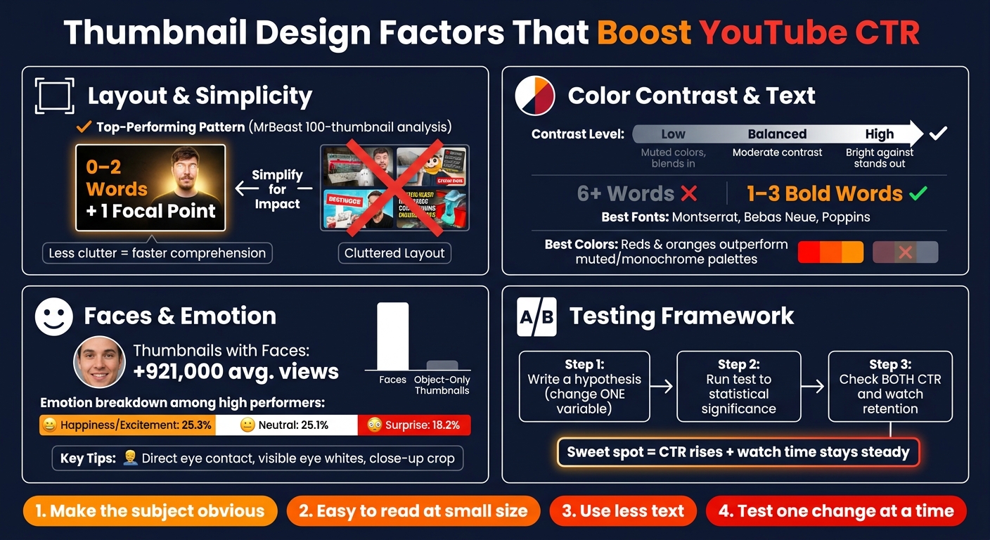
An analysis of 100 MrBeast thumbnails found a clear pattern: most used 0 to 2 words and one main focal point, usually a person. Research also shows that a clear visual hierarchy is strongly tied to perceived quality.
Put simply, one dominant subject, very little text, and no extra graphic clutter tend to beat busier designs.
Negative space and subject framing make thumbnails easier to read
When the main subject is set against a plain or high-contrast background, the eye knows where to go right away. That makes the thumbnail easier to read at small sizes in U.S. mobile feeds.
Tight, crowded layouts can look messy once they shrink down. More negative space gives the focal point room to stand out and makes the image easier to scan.
"Clarity is extremely powerful... While it may be tempting to go for a 'minimal' aesthetic, you run the risk of lower CTR." - Yang, Founder, Thumblytics
That line gets at the tradeoff. A thumbnail can be too sparse. If viewers can't tell what the video is about, the clean look doesn't help. Clarity has to come before style.
Once the layout is clear, contrast and text density decide whether the thumbnail still works at feed size.
Comparison table: simple vs. cluttered layouts
| Design Pattern | Performance Signal | Evidence Type |
|---|---|---|
| Simple layout (1–2 elements, 0–2 words) | Often seen in high-performing thumbnails | Data science analysis |
| Isolated subject against plain background | Better legibility and faster visual parsing | Design principle + expert observation |
| High negative space around main subject | Makes the focal point easier to read on mobile feeds | Design principle + expert observation |
| Cluttered layout (multiple icons, arrows, overlapping text) | Lower readability; seen as lower quality | Expert observation |
Next comes contrast and text density, which decide whether a clean layout still holds up in a crowded feed.
Color Contrast, Readability, and Text Density
Once the layout is locked in, color contrast and text choices decide whether a thumbnail still works at feed size.
High contrast generally outperforms low contrast in click rates
High contrast helps a thumbnail stand out in a crowded feed. It guides the eye fast, which is the whole game on YouTube. After layout, color and text are usually the next things worth testing.
A common setup is simple: put a bright or saturated subject in the foreground and place it against a darker or neutral background. Warm colors like red and orange often do well because they stand apart from everyday imagery and the standard YouTube interface. To keep text readable on mobile, use dark outlines or a soft glow.
Thumbnail designer Jay Gyoury says it plainly:
"Specifically, contrast makes a thumbnail pop, which is why many thumbnails include bright colors like red and orange."
That said, more brightness isn't always better. Push it too far and the image can start to feel messy instead of clear.
Once color gets attention, text has to land the idea right away.
Short text beats dense copy
Text overlays tend to work best when they tease something the viewer has to click to fully understand. Long sentences or 6+ words often become hard to read on mobile.
Stick with 1–3 bold words. Bold sans-serif fonts like Montserrat, Bebas Neue, and Poppins hold up well at thumbnail size. Short curiosity-driven phrases usually do better than dense copy.
Comparison table: contrast level, color scheme, and word count
The table below shows the main tradeoffs.
| Variable | Low CTR Pattern | Balanced | Stronger CTR Pattern |
|---|---|---|---|
| Contrast level | Low, blended elements | Standard separation | High, bright subject on a dark or neutral background |
| Color scheme | Monochrome or muted palette | Cool palettes (blues/greens) | Warm, saturated accents like reds and oranges |
| Word count | 6+ words or full sentences | 3–6 words | 1–3 bold words or curiosity-gap text |
| Typography | Small, thin, or decorative fonts | Standard sans-serif | Bold sans-serif fonts like Montserrat, Bebas Neue, or Poppins |
Faces, Emotion, and Human Signals in Thumbnails
After layout and contrast, the next fast signal is the human face. Faces give thumbnails an instant focal point, and study after study shows they pull more attention than images with objects alone.
Faces often outperform object-only thumbnails
Across multiple studies, thumbnails with a human face beat thumbnails without one. One finding stands out: thumbnails featuring faces average 921,000 more views than object-only options. That’s a big enough gap to make face inclusion worth testing.
From there, the next things to test are expression, gaze, and face size.
Expression, gaze, and face size affect click rates
Not every face gets the same result. Expression, gaze direction, and how large the face looks in the frame all shape whether a thumbnail earns the click.
Expression matters, but it doesn’t have to be over-the-top. Happiness and excitement appear in 25.3% of high-performing thumbnails, while neutral expressions appear in 25.1%. So no, you don’t always need a huge shocked face. But the emotion does need to be easy to read in a split second. The best expression also depends on the niche, so it should match the type of video.
Gaze matters too. Direct eye contact is a strong human signal. When someone looks straight into the camera - especially when the whites of the eyes are visible - people notice it more. Averted gaze tends to pull less attention.
Size is the other big piece. If the face is too small to read on a phone screen, a lot of that effect disappears. That’s why zooming in is so often recommended: it makes emotional cues easy to spot at a glance.
The safest way to test these choices is one change at a time.
Comparison table: no face, neutral face, and expressive face
| Variable | No face | Neutral face | Expressive face |
|---|---|---|---|
| Observed performance signal | Baseline | Common among high-performing thumbnails | +921,000 avg. views vs. thumbnails without faces |
| Typical share among high performers | Lower prevalence | 25.1% | 25.3% for happiness/excitement; 18.2% for surprise |
| Framing | No human signal | Face should still be clear and readable | Close-up, isolated face works best |
| Gaze | N/A | Less attention-grabbing than direct eye contact | Direct eye contact with visible eye whites draws attention |
Testing Thumbnail Changes and Applying the Findings
A basic A/B testing process for creators
Treat the patterns above like single-variable tests. Change just one thing at a time, such as the background, the face, or the text, and then track CTR. If CTR moves, you'll know what caused it.
Before you start, write down a simple hypothesis. Maybe you think adding a red border will lift CTR. That step matters more than it seems. It keeps you from making random edits and calling them wins.
Then let the test run long enough to hit statistical significance. Early traffic can swing up or down fast, and those first spikes can fool you. If you want a simpler setup, YouTube Studio's built-in Test & Compare feature can handle much of the side-by-side work.
CTR isn't the only number that matters. Watch retention too. If CTR climbs but people leave in the first 30 seconds, the thumbnail may be pulling in the wrong viewers. The sweet spot is simple: CTR goes up and watch time stays steady.
These tests also depend on the footage you start with. If the frame is muddy or hard to crop, even a smart test can turn messy.
How production quality supports better thumbnail testing
Better footage gives you sharper stills, cleaner crops, and stronger contrast for thumbnail tests. That makes each version easier to compare.
Using a teleprompter app like Evelize while filming can help you plan those stills instead of hunting for them later. A small shift during production can save a lot of trial and error when it's time to build thumbnails.
Conclusion: What the research says creators should focus on
Across the studies, the same signals keep showing up: clarity, contrast, faces, and short text. Test one variable at a time, then read CTR next to retention.
FAQs
What is a good CTR on YouTube?
There’s no single benchmark for a good click-through rate (CTR) on YouTube.
That said, research suggests that about half of videos land somewhere between 2% and 10%. And above 5% is often seen as a strong result.
The catch? CTR can swing a lot based on your niche, your audience, and where those impressions come from. So instead of chasing a single “good” number, it makes more sense to compare your CTR against your own past results.
Do faces always improve thumbnail CTR?
No. Faces don’t always improve click-through rates.
A lot of popular videos do feature human faces. But the data shows their impact depends on context, not some magic rule that works every time.
What matters is things like how familiar your audience is with your brand, the type of video, and whether the facial expression clearly signals an emotional hook.
That’s why split testing is still the best way to find out what works for your audience.
How do I test thumbnails without hurting retention?
Test thumbnails in a way that matches what’s actually in the video. The goal isn’t clickbait. It’s getting the right people to click.
When you run A/B tests, don’t look at CTR alone. Track watch time and viewer satisfaction too. A spike in clicks can look good at first. But if view duration drops by more than 5%, that thumbnail may be setting the wrong expectation.
For cleaner results, change only one element at a time. And give each variant enough data to mean something: aim for 1,500 to 2,000 impressions per variant over 7 to 14 days.
Related Posts
Ready to Elevate Your Content?
Try Evelize for free and experience the easiest way to create, edit, and share professional videos. Script writing, teleprompter, and powerful video tools - all in one app!

